SHORTLISTED IN THREE CATEGORIES FOR THE 2018 MyWW IN-HOUSE DESIGN AWARDS:
• Best Internal Rebrand/Brand Development
• Impact on the Overall Business
• Best Example of External Collaboration
Since its inception in 1959, Chapman Taylor has evolved from being a London-based architectural practice to a diverse global design group today. In response to this transformation, we began a process of redefining our values and creating a new understanding of who we are as a practice, honouring our heritage and forging a new approach to the challenges of the future.
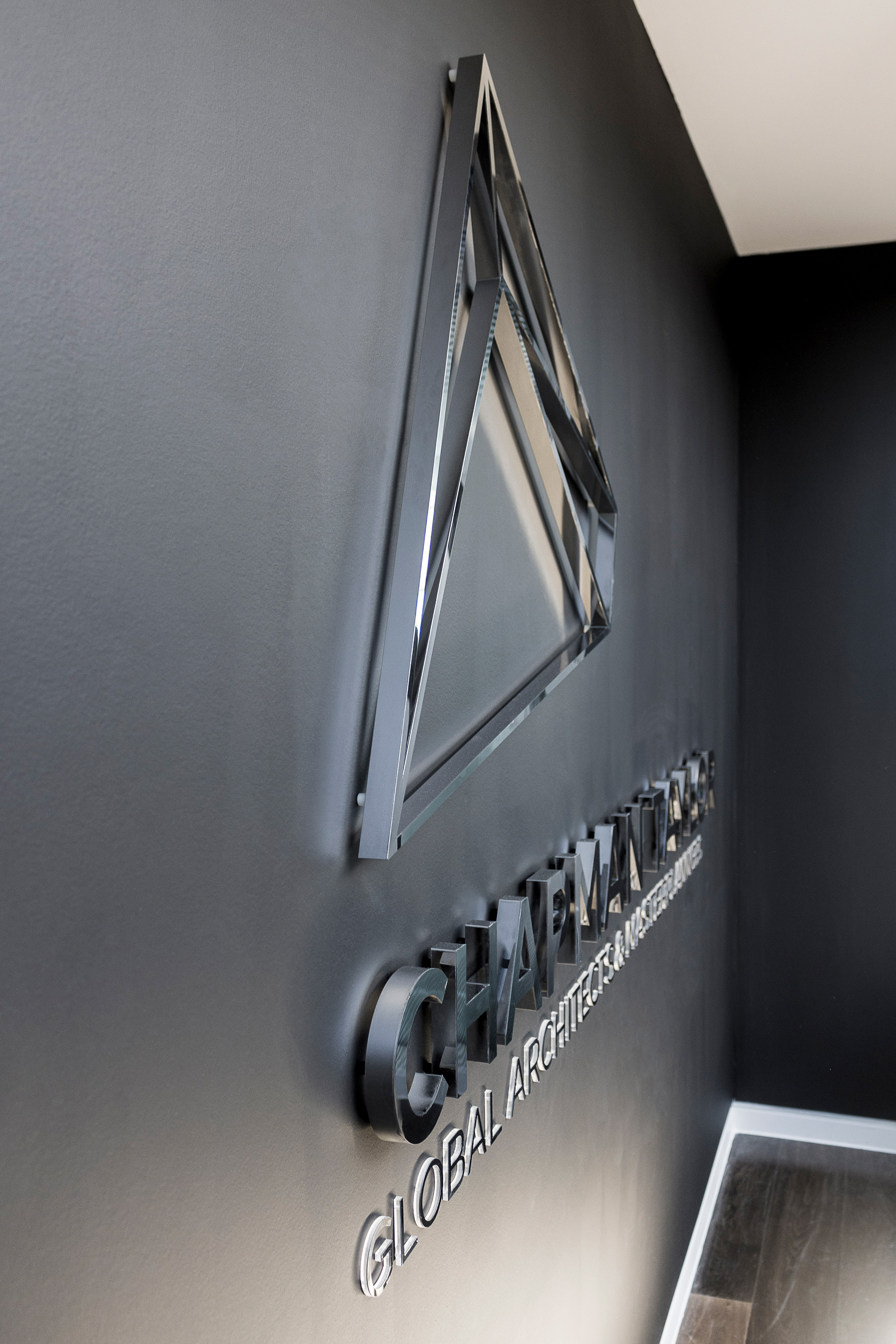
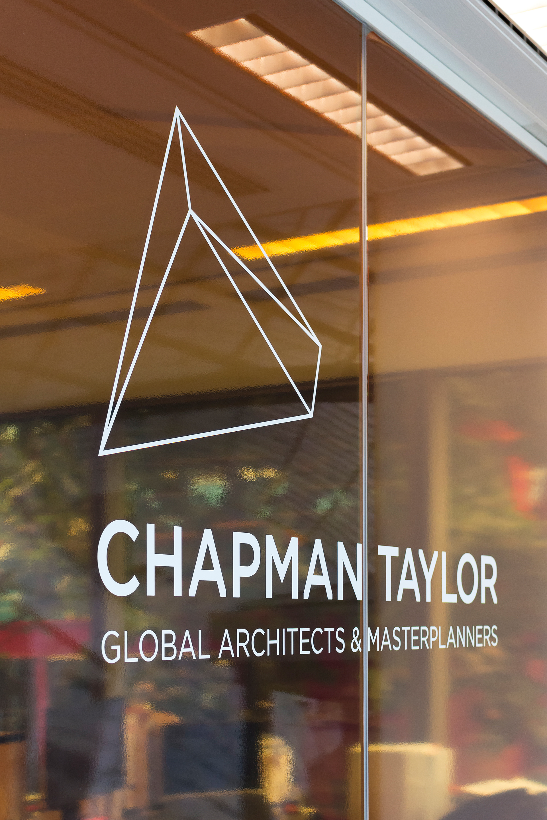
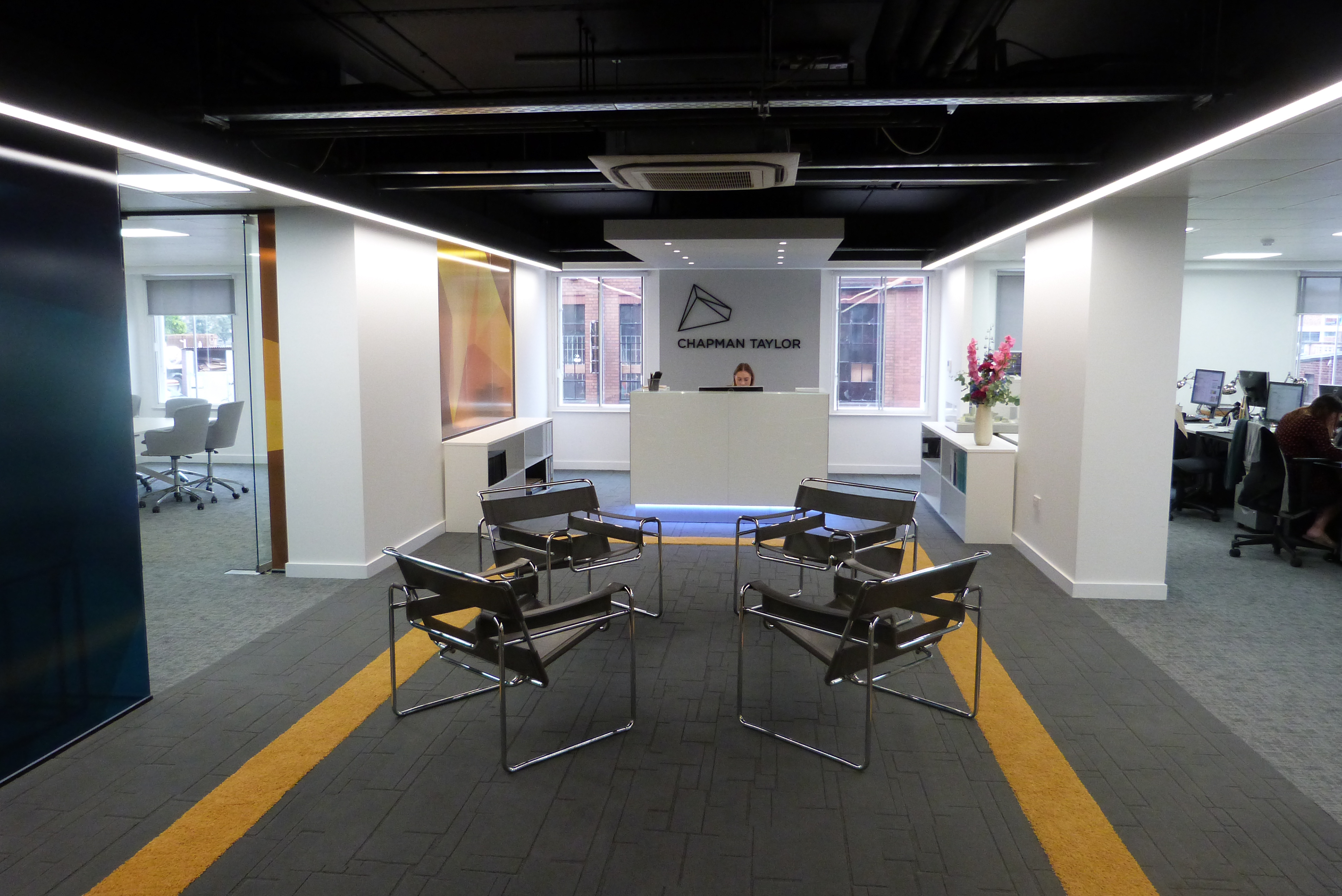
The outcome has been the creation of a new brand and visual identity for Chapman Taylor, which is designed to encapsulate the diversity of our projects, people, clients, locations, sectors and studio locations. To highlight what makes us unique as a practice, we turned to our global reach for inspiration. Using the locations of our studios around the world, we built a 3D model of our global network, creating a distinctive, multi-faceted polyhedron which has become central to our new visual identity.
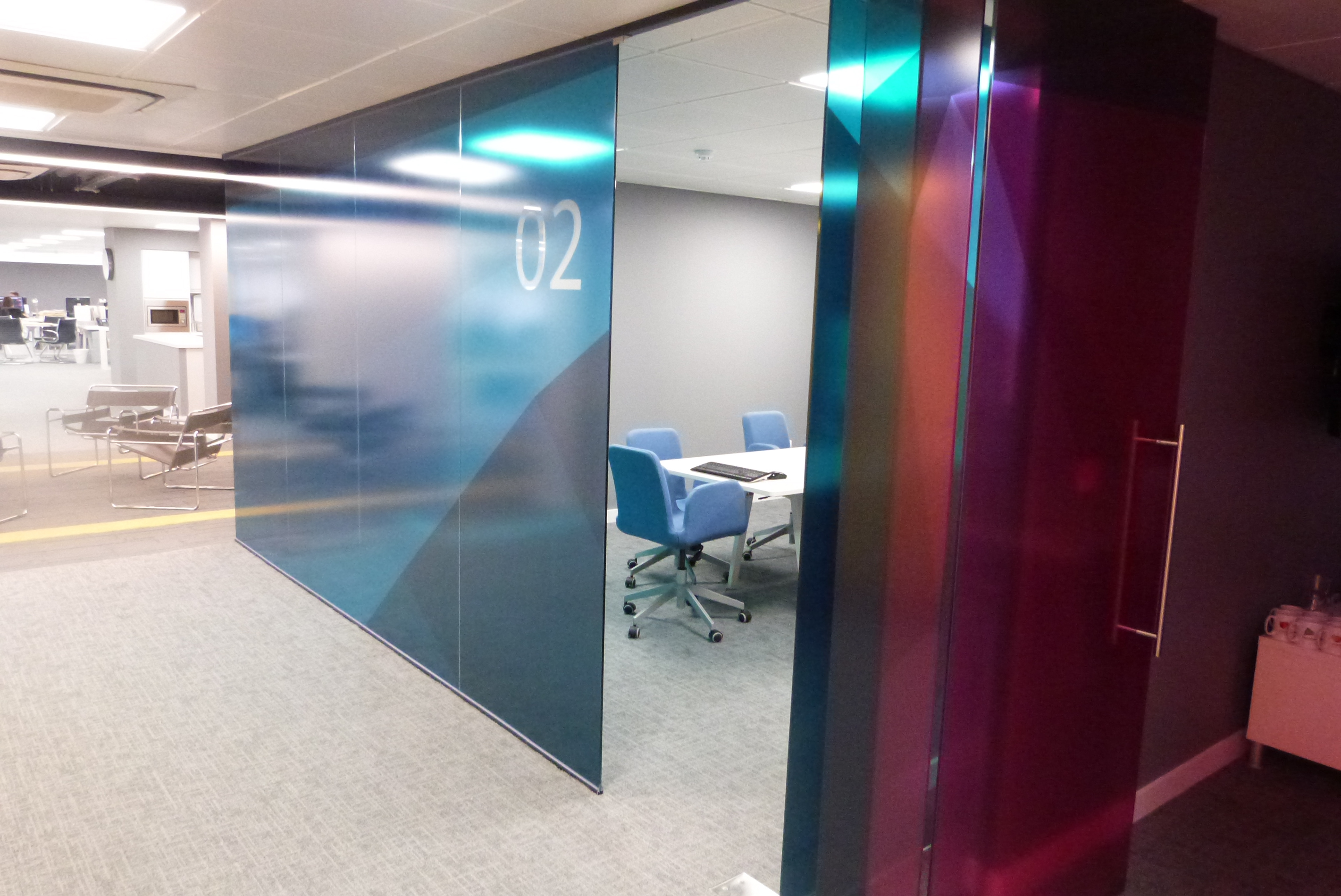
By using a 3D approach, an infinite number of forms can be generated from different views of the polyhedron. A selection of these shapes has been used to create our company logo and identities for our core sectors. Each sector is also distinguished using a colour from our secondary colour palette and, alongside our corporate typeface, they create a coherent visual language for the brand while still maintaining a distinctive identity for each of the sectors we work in.
The flexible nature of the identity allows us to create designs for a wide range of applications and media. At a corporate level, a full suite of stationery has been produced, employing black and silver foil on Fedrigoni stock. This is also complemented by our group brochure, office signage and a range of promotional items including tote bags, pencils, notebooks, USB sticks and umbrellas in our primary black and silver colour palette.
Alongside our printed marketing collateral, we also developed a number of internal brand applications, allowing us to explore the creative potential of the new identity. These included internal email newsletters, coffee mugs for our studios, updated material for our internal groups and items for promoting the internal launch, held for staff across the group. The launch was also accompanied by the release of a comprehensive set of brand guidelines to support the use of our brand assets and artwork.
